4. Controls
Overview
Controls are the "widgets" users interact with on a page. Domkit includes a standard set of controls that can be used to build UIs:
- Button
- ButtonGroup
- Checkbox
- Combo
- FilePicker
- Label
- ListButton
- Link
- Menu
- ProgressBar
- RadioButton
- Table
- TextArea
- TextField
- ToggleButton
- Tooltip
- Tree
Button
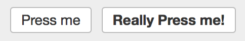
Button is a widget that invokes an action when pressed.
Button
{
  it.text = "Press me"
  it.onAction { echo("Pressed!") }
}

Button
{
  it.add(Elem("b") { it.text="Really Press me!" })
  it.onAction { echo("Pressed!") }
}
See Button for full API details.
See also: ToggleButton, ListButton
ButtonGroup
ButtonGroup groups a set of toggle or radio buttons and handles making sure only one button in group is selected at a time.
group := ButtonGroup
{
  it.add(ToggleButton { ... })
  it.add(ToggleButton { ... })
  it.add(ToggleButton { ... })
}

group.selIndex = 1      // set group selection
sel := group.selIndex   // get current selection
See ButtonGroup for full API details.
See also: ToggleButton, RadioButton
Checkbox
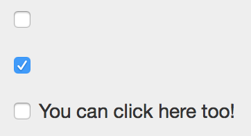
Checkbox displays a checkbox that can be toggled on and off.
Checkbox {}
Checkbox { it.checked = true }
On its own, only the actual checkbox is displayed. Generally its desirable to display a text label attached to the checkbox. You can extend the click target area to this label using the wrap method:
Checkbox {}.wrap("You can click here too!")
To receive callbacks when the state changes, add an onAction event handler:
Checkbox
{
  it.onAction |c| { echo("checked: $c.checked") }
}
See Checkbox for full API details.
Combo
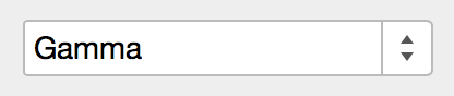
Combo combines a TextField and ListButton into a single widget that allows a user to select from a list or manually enter a value. The internal TextField component is available with Combo. In practice you will interact with Combo the same as TextField, so Combo.field is the right place to register event callbacks such as onModify and onAction.
Combo
{
  it.items = ["Alpha, "Beta", "Gamma"]
  it.field.onAction |f| { echo("value: $f.val") }
}
See Combo for full API details.
FilePicker
FilePicker allows selection of files to upload from the client browser.
For simple form uploads, FilePicker is backed by an <input type="file"> so can be enabled just by giving a name when inside a <form>:
FilePicker { it->name="upload" }
To configure what file types can be selected, or to enable multiple selection:
FilePicker
{
  it.accept = "image/*"   // allow only images
  it.multi  = true        // allow multiple files to upload
}
To receive callbacks when a file is selected, add an onSelect event handler:
FilePicker
{
  it.onSelect |p| { ... }
}
The list of selected files can be introspected client-side via the files field:
// list of files
files := picker.files

f.name    // filename of file
f.size    // size of file
f.type    // MIME type of file

// async load file contents as a text string client-side
f.readAsText |text| { ... }

// async load file contents and encode as a data:// URI client-side
f.readAsDataUri |uri| { ... }
The FilePicker UI can be customized by hiding the actual FilePicker DOM element and using the open method to programmatically trigger displaying the browser's native file picker:
picker := FilePicker { it.style->display="none" }

button := Button
{
  it.text = "Choose Files"
  it.onAction { picker.open }
}

parent.add(picker)   // make sure FilePicke is actually mounted in DOM
parent.add(button)
See FilePicker and DomFile for full API details.
Label
Label simply displays text content. Labels are designed to naturally align vertically with control widgets like Button:
Label { it.text="My Label" }
See Label for full API details.
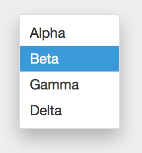
ListButton
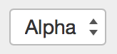
ListButton allows user selection of a list item by showing a listbox popup when a button is pressed:
ListButton
{
  it.items = ["Alpha", "Beta", "Gamma"]
  it.onSelect |b| { echo("Selected $b.sel.item") }
}
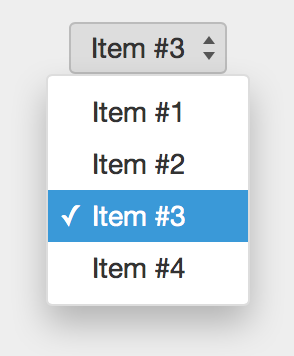
By default ListButton will display items using toStr. To customize how the display element is is created, use onElem:
ListButton
{
  it.items = [1,2,3,4]
  it.onElem |v| { "Item #$v" }
}
See ListButton for full API details.
Link
Link creates an <a> tag for links:
Link
{
  it.uri  = `https://fantom.org`
  it.text = "Fantom"
}
Use target to specify a link target:
Link
{
  it.uri    = `https://fantom.org`
  it.text   = "Fantom"
  it.target = "_blank"
}
See Link for full API details.
Menu
Menu displays a menu of selectable MenuItems.
menu := Menu
{
  MenuItem { it.text="Alpha"; it.onAction { ... } },
  MenuItem { it.text="Beta";  it.onAction { ... } },
  MenuItem { it.text="Gamma"; it.onAction { ... } },
  MenuItem { it.text="Delta"; it.onAction { ... } },
}

menu.open(100, 100)
See Menu for full API details.
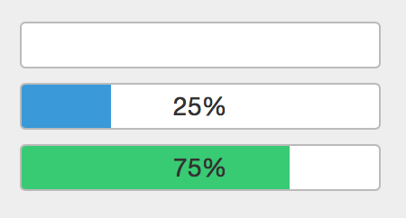
ProgressBar
ProgressBar visualizes progress of a long running operation.
ProgressBar {}

ProgressBar
{
  it.val = 25                     // set progress value
  it.onText |p| { "${p.val}%" }   // set bar text
}

ProgressBar
{
  it.val = 75
  it.onText |p| { "${p.val}%" }
  it.onBarColor |p| { "#2ecc71" }  // set bar color
}
See ProgressBar for full API details.
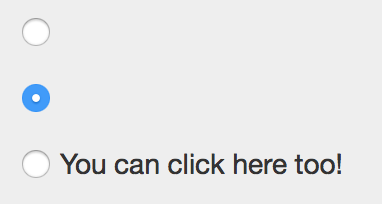
RadioButton
RadioButton displays a radio button:
RadioButton {}
RadioButton { it.checked = true }
On its own, only the actual radio button is displayed. Generally its desirable to display a text label attached to the radio. You can extend the click target area to this label using the wrap method:
RadioButton {}.wrap("You can click here too!")
To receive callbacks when the state changes, add an onAction event handler:
RadioButton
{
  it.onAction |c| { echo("checked: $c.checked") }
}
For grouping sets of radios for exclusive selection, see ButtonGroup.
See RadioButton for full API details.
Table
Table displays a grid of rows and columns.
@Js class MyTableModel : TableModel
{
  override Int numCols() { 100 }
  override Int numRows() { 10 }
  override Void onCell(Elem cell, Int col, Int row, TableFlags flags)
  {
    cell.text = "C$col:R$row""
  }
}

Table
{
  // Note that 'rebuild' is required to display the initial
  // table, and to update the table due to any model changes

  it.model = MyTableModel()
  it.rebuild
}
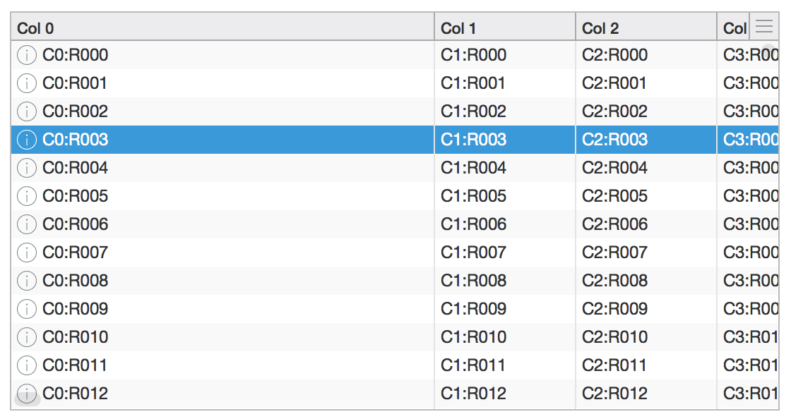
Common table operations:
// toggle table header
table.showHeader = false

// sort a column
table.sort(2, Dir.down)

// customize zebra-striping for table rows; use empty list
// to remove background color from all rows
table.stripeClasses = [,]
table.stripeClasses = ["even", "odd"]

// enable multiple selection
table.sel.multi = true

// callback when selection changes
table.onSelect |t| { echo(t.sel.index) }

// callback when row is double-clicked; to access Selection.item
// be sure to override TableModel.item to return backing object
table.onAction |t| { echo(t.sel.item) }

// callback for cell events
table.onTableEvent("mousedown") |e| { echo(e) }

// enable custom header popup located in top-right corner of table
table.onHeaderPopup |t| { return Popup { ... }}
See API for full details: Table, TableModel, Selection, TableEvent
TextArea
TextArea allows multi-line text input.
TextArea
{
  it.cols = 40
  it.rows = 10
  it.val = "Some text\n  Here\nAnd there"
}
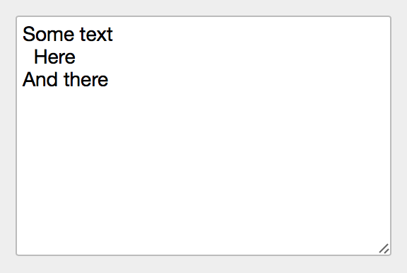
Use onModify to receive callbacks when text is modified in TextArea:
TextArea
{
  it.onModify |f| { echo(f.val) }
}
See TextArea for full API details.
TextField
TextField allows text input.
TextField {}
TextField { it.val = "Hello, World" }
TextField { it.placeholder = "Search..." }
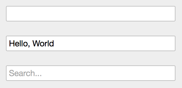
Use onModify to receive callbacks when text is modified in TextField:
TextField
{
  it.onModify |f| { echo(f.val) }
}
Use onAction to receive callbacks when the Enter key is pressed in a TextField:
TextField
{
  it.onAction |f| { echo(f.val) }
}
See TextField for full API details.
ToggleButton
ToggleButton models a boolean state toggled by pressing a button:
ToggleButton
{
  it.text = "Toggle Me"
  it.onAction |b| { echo("state: $b.selected") }
}
The content may be modified based on selected state by specifying elemOn and elemOff:
ToggleButton
{
  it.elemOn  = Elem { it.text="On" }
  it.elemOff = Elem { it.text="Off" }
  it.selected = false   // make sure to set default state last
}
You may also pass any object to elemOn and elemOff and the Elem instance will be created using Obj.toStr:
ToggleButton
{
  it.elemOn  = "On"
  it.elemOff = "Off"
  it.selected = false
}
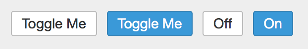
For grouping sets of toggle buttons for exclusive selection, see ButtonGroup.
See ToggleButton for full API details.
Tooltip
Tooltip displays a small popup when the mouse hovers over the bound node element, and is dismissed when the mouse moves out.
Tooltip
{
  it.text = "More info here!"
  it.bind(parent)
}
See Tooltip for full API details.
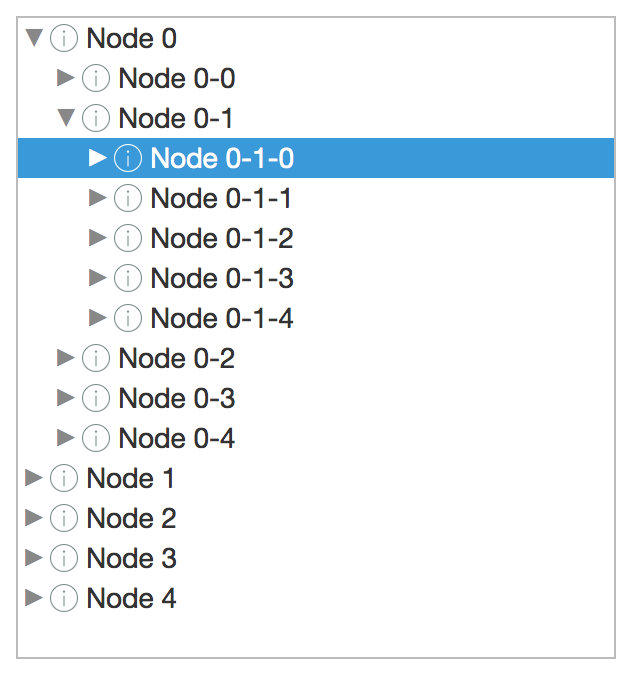
Tree
Tree visualizes TreeNodes as a series of expandable nodes.
@Js class MyTreeNode : TreeNode
{
  new make(Obj item) { this.item = item }
  override TreeNode[] children() { ... }
  override Void onElem(Elem elem, TreeFlags flags)
  {
    elem.text = obj.toStr
  }
  private Obj obj
}

Tree
{
  // Note that 'rebuild' is required to display the initial
  // tree, and to update the tree due to any model changes

  it.roots = [MyTreeNode(...), MyTreeNode(...), ...]
  it.rebuild
}
Common tree operations:
// callback when selection changes; item is TreeNode instance
tree.onSelect |t| { echo(t.sel.item) }

// callback when row is double-clicked; item is TreeNode instance
tree.onAction |t| { echo(t.sel.item) }

// callback for node events
tree.onTreeEvent("mousedown") |e| { echo(e) }
Note that Selection.index is not valid for Tree instances.
Lazily-loading tree nodes:
@Js class LazyTreeNode : TreeNode
{
  new make(Tree tree, Obj item)
  {
    this.tree = tree
    this.item = item
  }

  ...

  override Bool hasChildren()
  {
    // return true if kids not loaded
    kids==null ? true : kids.size > 0
  }

  override TreeNode[] children()
  {
    // return kids if already loaded
    if (kids != null) return kids

    // async load kids
    doAsyncLoad(this) |items|
    {
      this.kids = items.map |i| { LazyTreeNode(tree, i) }
      tree.refreshNode(this)
    }

    // return empty; doAsyncLoad will refresh
    return TreeNode#.emptyList
  }

  private Tree tree
  private Obj item
  private LazyTreeNode[]? kids
}
See API for full details: Tree, TreeNode, Selection, TreeEvent